AWAY FROM HERE
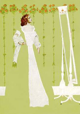
 Unveiled -- here's my cover illustration for this September's issue of ASIMOV'S SCIENCE FICTION. It's based on the issue's lead story, Lisa Goldstein's "Away From Here." She was recently a Nebula Award finalist, and her new story is terrific. It's about hotels, wanderlust, and passing strangers.
 A quirk in the story (no spoilers) inspired not only the subject, but also my compositional solution. A bit of art history: Coles Phillips was a popular American illustrator of the 1910's and 20's. His work was all the rage in advertising. He's famous for his "Fadeaway Lady" illustrations (see left) where he juxtaposed foreground and background elements of the same color. The results caused readers to look twice and complete the pictures with their imaginations.
It was fun to see how much I could subtract from an image and still have it "read." Thanks to art director Victoria Green for the encouragement, and to La Julia and Traci for helping me find magic where others might only find the mundane.


13 Comments:
Beautiful!
And it works!
Looks great!
just stunning! One of my favorites now!
Thanks, Christine. Thanks, Charles. Much appreciated, Mair. Glad you folks dig it. :)
You really don't notice that her body is missing when you first look at it. Only after "studying" it do you see it.
I think you did a better job than Phillips as far as the fade away aspect.
Very kind of you to say! I'm glad you like it. Thank you. :)
Beautiful piece of work there, John, as ever. And thanks for introducing me to Coles Phillips, an artist I was unaware of - some really lovely work here: www.americanartarchives.com/phillips,c.htm He was obviously someone who could appreciate a lady with a well-turned pair of legs. (And who doesn't?)
Thanks, Colin. Much appreciated! RE: Coles Phillips -- well-said. ;)
That's gorgeous, John.
Much appreciated, Stephen......see you in Montreal!
Maybe one of my favorite pieces of yours now.
John, will you have prints of this at any cons coming up???
Hi, Lou.....hi, Mair -- Sorry I've been distracted over here.
Lou -- thanks, man. Means a lot coming from you!
Mair -- yes, I will have prints of this, coming this fall. Will post here as soon as I do. :)
Post a Comment
<< Home