THE 13TH REALITY
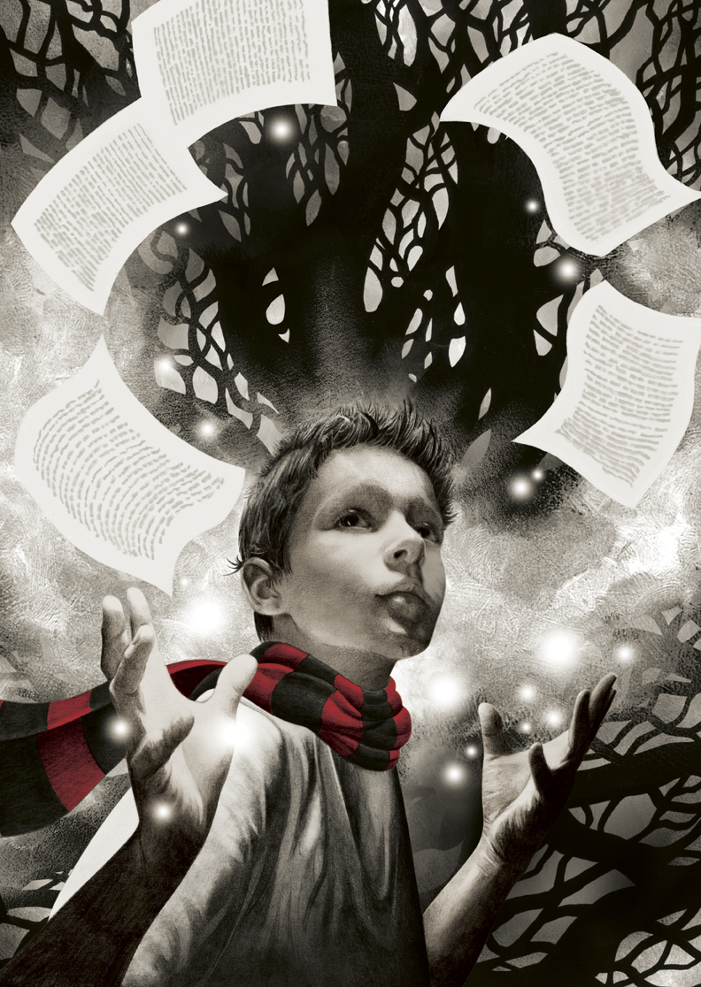 Here's my cover art for James Dashner's THE 13TH REALITY: THE JOURNAL OF CURIOUS LETTERS, just released this week in a fresh new edition from Aladdin. When you see the book on the shelf, you'll notice it's got a different color scheme. Although I did both versions, the one pictured left is my preferred version.
 Why two versions? When the job came to me, it was noted that the book was targeted toward "independent readers" which is defined as 9-12 year-olds. It was also noted that the cover would be printed on silver foil. Early in the process, I went to the bookstore and stared at the shelves of books that this cover would compete against. It was immediately obvious that this market uses a LOT of color and flash to grab eyeballs. Every cover seemed to be trying to out-flash the one next to it. That's not unlike the adult sf/f section, but the tendency was perhaps a little more aggressive throughout the independent reader shelves. That's what inspired the color scheme you see here -- a direct counterpoint to the book's competition -- spare and ultra-restrained, where one key element (the scarf) calls out, and the rest of the art plays off the shimmer of the foil material. It seemed like a surefire strategy to help the book stand out and sell, and I was excited to see the final result. Well, you know what they say about the best-laid plans of mice and men....;)
The version you see here was deemed "too sophisticated for 9-12 year-olds". Oy. Anyone have any 9-12 year olds in their family? If you do, you know that one thing you can count on is they're extremely visually sophisticated, and probably more so than most of us adults.:) Best wishes to all at Aladdin and to Mr. Dashner himself, who seems to be having a heckuva year thanks to THE MAZE RUNNER's steamrolling success.
Time to wrap some presents over here. Happy Holidays to all!
posted by John Picacio at 11:42 AM
![]()
![]()


3 Comments:
Yeah, I have to say I also prefer your preferred version, John. It's understated and quite lovely.
It would have been cool to see that B+W version on silver foil...I have seen some amazing things done with minimal color and foil stock...Let's hope it does very well, anyway.
Happy Holidays to you, John.
Thanks, Jason....thanks, Mair. Happy New Year to both of you. :)
Post a Comment
<< Home