ZOO CITY
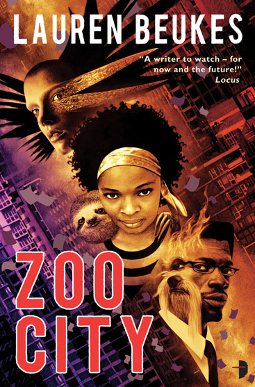
 Here's my final cover illustration for Lauren Beukes' forthcoming novel ZOO CITY. It'll be an Angry Robot mass market paperback, coming this May. Lauren is the author of one of 2009's breakout hits, MOXYLAND. She describes ZOO CITY as an urban fantasy -- "a muti noir set in a re-imagined Johannesburg. It's the story of a girl with a sloth on her back, a dirty 419 habit and the magical ability to find lost things who gets drawn into a case to find a missing pop star."
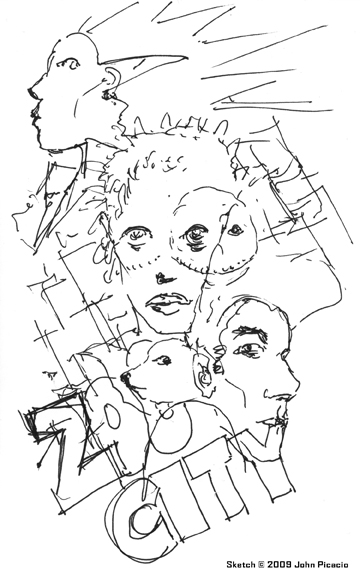
 Here's my initial thumbnail doodle for the cover. I even drew in a first stab at the typography, just to get some sense of how that might work (or not). I knew I was only responsible for the cover art, but I factor in the type placement when I sketch thumbnails for covers. Sometimes I draw it in, even if I'm not designing the final type, and sometimes I just leave space for it. It's always a consideration though. The final type design is by Argh! Nottingham (see below), and I dig it. It's a simple, strong solution, and says "noir" without being cliche.
 As for the art, I was given a solid brief from Angry Robot that described what they wanted on the cover. They wanted three main characters, and their pets, to be the focus, and offered a fairly specific way to handle it. I saw the cover a completely different way, but made sure to include all of the elements (main characters, pets, setting, mood, attitude). They were terrific and said "go for it!"
Relevant note here -- it's not often that authors have input during the process of making a cover. There are lots of reasons for this, and that could be a whole blog post by itself. The point is it doesn't happen often. In this case, Lauren was very involved, and she and Marc Gascoigne (publishing director) were fun collaborators. It was my first time working with Angry Robot, and a pleasure. They're building a terrific line of books. I'm really excited about ZOO CITY, and am already looking forward to its release in May.


3 Comments:
That is a fantastic cover! But you really need to zoom it to a bigger size to see all of the incredible and interesting detail in it - especially the animals. I also really like the diagonal placement of the 3 figures. A great start to 2010!
Thanks, Christine! I appreciate it very much! :)
Wow. Just...wow.
I love the angles, the human/animal morphing, the palette...Great stuff, as always.
Post a Comment
<< Home